Posts

Showing posts from September, 2017

Aperture, Shutter Speed, and ISO

Image
f2.8 f16 1. We can closely relate aperture to our eyes. 2. The smaller the aperture size, the higher the aperture f-stop number. 3. Aperture effects depth of field by how much it blurs out the background, and the area in focus. high shutter speed slow shutter speed day time (a) high shutter speed (b) moderate shutter speed (c) very high shutter speed (d) very high shutter speed (e) high shutter speed (f) very high shutter speed night time (a) lower shutter speed (b) low shutter speed (c) moderately low shutter speed (d) moderately low shutter speed (e) lower shutter speed (f) moderately low shutter speed   2. The three settings on my camera are aperture priority, shutter priority, and manual mode. Aperture priority lets you focus on the aperture and the camera calculates the shutter speed for you. Shutter priority lets you set the shutter speed and sets the aperture for you.  Manual mode sets the aperture and the shutter speed for you. 

Peer Critique

Amy's Photo Journalism Blog    I liked how all her photos included people working, I also liked her first picture of the girl with her hand up.   One thing that could be improved is her subject matter, i think that since she chose the same type of subject for all of her photos the got kind of boring and it seemed like I was looking at the same photo. (This is just my opinion I personally enjoy variety in photos)

Academic Post Shoot Reflection and Critique

     I had some trouble taking photos in classes because some of the kids would not be mature, and others would look straight into the camera while I was taking photos, and then I couldn't use that photo I took because there is someone staring directly into the shot on a candid photo (ARGGGGGRHRR). I found myself thinking about framing, positioning, and focus the most while taking my photos. I wanted my photos to have an interesting angle and have what I want in it while being focused on the subject. If I could do the project again I would try and use more rules of composition and find pictures that I could take representing them. I would also try to do photos that related more directly to the prompt instead of taking photos of objects in the library. That said if I could do this again I would still take pictures in the library, because there is some pretty interesting stuff in there that I really like, I would also continue to take photos of people studying and working on projects

Academic Shoot

Image
In this photo I used the composition rules of balance and rule of thirds. The subject on the left is balanced out by the people on the left side of him, and the subject is in the left hand third of the photo. The subject is the kid with the bowl cut on the left, i think that it is pretty clear that he is the subject because he is the only person in focus and he takes up a third of the photo.   In this photo I used the composition rule of balance, the two boys balance out each other in this photo. The subjects are the two boys that are studying, and i think that is pretty clear because they are the only ones in the photo.  In this photo I used the composition rule of thirds by having the main subject in the bottom left third of the photo. The subject is the girl drawing, and i could have made that more clear by taking a different angle that makes her the main focal point instead of the boy. 

Manipulated Photos

Image
I believe that this photo was one of the more unethical ones because it pretty greatly changed Kim's body, on the left I see a normal women who looks like anyone else does, with a "bra side bulge" and a naturally uneven skin tone. When they altered the photo it made her look almost plastic with the unrealistic beauty standards they gave her. I would have liked this a lot better if they hadn't posted the altered photo because the one on the left looks like a woman, not someone who is half plastic half woman.  This photo is the least unethical because they only changed her teeth, not her whole body. The teeth are hardly even noticeable and its not like the picture above where they have changed every aspect of her body. I would not have noticed the difference if they had not zoomed in on the teeth on the bottom .

Photo Manipulation and Ethics

A. Some of the main points I read in this article was that when you manipulate a photo it changes how other people can perceive it. If you remove, add or edit things in the photo it can change the meaning and overall view of the image. B. They believe that altering a photo could bring in more profits because the image would look more appealing to the eye.  The altered photos increase readership and overall sales for their company. C. Some things that I think are acceptable are correcting red eyes, correcting blurry photos, adjusting the brightness so you can better see the subject, and adding a color filter to the photo (i.e. black and white, yellow correcting filter) as long as the filter doesn't affect the rendering of the image.

Lisette Model Bio

Image
    Family and Childhood  Lisette Model was born on November 10, 1906 in Vienna, Australia, she then died in 1983. She grew up in a wealthy upper-middle class family with her older brother and her younger sister. Her mother was French Catholic and her father was Jewish and a militant doctor. At a young age her father sexually molested her, she did not let this affect her life but her close friends and acquaintances can remember the pain it caused her early on. Her father later died of cancer in 1924, and the family wealth died with him.     Education and Books   Model was fluent in 3 languages, and she got her higher education from tutors that her mother got for her and her siblings. She studied in Vienna first, then moved to Paris and studied under Arnold Schoenburg for music, he eventually broadened her spectrum of the arts and introduced her to other artistic things. While living in Paris she married the Russian artist Evsa Model. She had a struggling career with art and music a

2012 winner

Image
I chose this photo because the paint coming back up creates an interesting effect that I really enjoy. the elements that are present in this photo are balance, and framing. framing is present through the box that is containing the paint splatter.

Filling the Frame

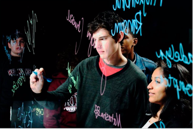
Image
This photo is filling the page with the people in the background and the words on the glass that are seemingly floating in the air. 

Action

Image
This picture is showing action because the sparks are flying giving it an interesting effect, the blade on the saw is also moving and you can almost imagine her moving the saw across the metal and you can almost hear the saw going. 

The Story

Image
This picture has a story because it is a kid getting his cosmetology degree and setting himself up for a career later in life. He wants to graduate high school with his life in order without having to pay fees for cosmetology school.     

Avoiding Mergers

Image
                                           Douglas Smith This photo avoided mergers by cropping out the people on the streets and only focusing on the falling North Tower. 

Balance

Image
                                             John Vanover This photo shows balance by having 2 separate skylines or building lines. the lower one is heavier or more dense on the right, while the upper skyline is heavier or more dense on the left.   

Framing

Image
                                             Morgan Reynolds This photo shows framing by the buildings on the side framing the smoke coming from the devastation. 

Lines

Image
                                                      Mike King This photo shows lines because the diagonal angle of the tower makes it more dynamic and interesting, and guilds your eyes to the smoke above.  

Simplicity

Image
                                              Alex Fuchs I believe that this photo shows simplicity because the background is relatively plain and lets you focus on the remnants of the tower.  

Rule of Thirds

Image
                                              Comer Zhoa I believe that this photo shows the rule of thirds because the focal point,which is the top of the building, is not directly in the center, but off to the upper left hand side.

Post Shoot Reflection

   Some of the challenges I encountered while taking my photos where when my photos didn't save to my computer and I had to go retake them, I also had trouble when I was taking candids of people to capture the photo in a way that nothing was blurry because it was moving. When I was taking my photos I found myself thinking about framing and focusing the most, I would set my photo up in a way to make it a little more dynamic and seem a little more raw instead of polished and posed. If I had a chance to do this project again I would try to focus my photos a little bit better and make sure there is no glare, I also think that I would try to go further with the prompt instead of sticking to a more literal sense. Some of the things I would do the same would have to be I would continue to take more candids of people, because overall they are my favorite photos to take. I would enjoy doing the happy and the metal prompt again but I don't think I enjoyed the Bowie or the square prompt

Prompt Shoot 1

Image
Happy  I feel like i achieved the rule of three with this photo by having 2/3 of my subjects not in the center of the photo. I also think that I had dynamic lines on the floor going diagonally.  Metal I definitely have dynamic lines that are cascading upwards to the second floor.  Bowie  The only thing i think i have in this picture might be simplicity.   Square  I used lines in this photo to make it a better background image.  (as in be there or be square, or ya know the windows)

Photography Questions

1. Camera Obscura is achieved by completely blacking out a room with plastic over the windows, then poking a singular pinhole into one of the windows plastic, allowing a small bit of the light from outside to come in. This ends up projecting the scene outside into the room. Camera Obscura produces a photo that looks like a regular room, but with the outside world on the inside. 2. The Camera Obsucra was the first "camera". 3. When optical lenses where improved we became 1 step close to creating the actual camera. 4. Niepce invented the film to put into the cameras. 5. Digital cameras still have the light go through he lens and exposes the film, just like their ancestors. 6. With program you can control flash and a few other settings compared to auto mode. 7. Portrait is used to blur out the background and focus on the fore ground. It works using the fastest aperture speed 8. To freeze motion so you can capture something moving at a fast pace they use the fastest