Architecture Preview #1 and #2
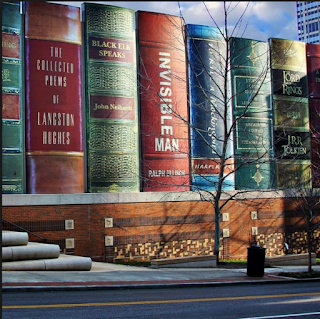
Kansas City Public Library, United States
1. I couldn't find the architect.
2. 2006
3. Kansas City, U.S
4. Public Building
5. No info on the cost.
6. The building was created to beautify a parking garage near the Kansas City Library.
7. I picked this building because I am a total book nerd, and I liked the idea of someone using this as a front for a library. When I looked a little further into it i found out that it was the city's way of beautifying a parking garage, and it made me happy that someone thought of instead of building a big gray block of concrete, they built large books that made it so they have a pop of color in their city.
 |
| Patterns |
 |
| Details |
 |
| Surroundings |
 |
| Angles |
 |
| Lighting |
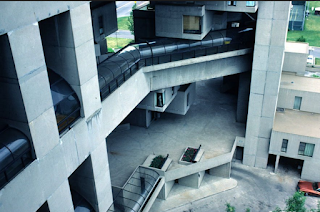
1. Piet Blom
2. 1977
3. Rotterdam, Holland
4. One of the Cubes is open to public viewing.
5. No info on the cost
6. The buildings were created to resemble a triangle forest.
7. I chose these buildings because i like the warped-feel they give off. I also enjoy the color of them and I think that that adds to how well they stand out in their background, yellow is pretty cool and I'm always down for that. These buildings feel like they are straight out of an abstract art piece and I love that vibe.
 |
| Lighting |
 |
| Patterns |
 |
| Details |
 |
| Angles/Shapes |
National Centre for the Performing Arts, China
1. Paul Andreu
2. Finished construction in 2007
3. Xicheng Qu, China
4. Open to public
5. 300 million
6. It was created to be a theatre, choir house, and an orchestra stadium.
7. I was attracted to this building because it was a preforming arts school, so even before looking at a picture of it I was intrigued. I like the way this building looks because it is so symmetrical and the glassy water adds to the appeal. I also like how it is placed in this pool/shallow lake, and how you have to go under the lake just to get to class everyday.
 |
| Details |
 |
| Lighting |
 |
| Surroundings |
 |
| Patterns |
 |
| Angles/ shapes |
Turning Torso, Sweden
1. Santiago Calatrava
2. 2001
3. Malmö, Sweden.
4. Its residential, so no public.
5. No price info
6. It is a residential apartment/loft building.
7. I chose this building because it was subtlety weird. When you first look at it is is like "oh yeah thats cool" but after you see it and look at it for a second you see that it is turning around and it gives off a unique effect. I also like that someone came up with this idea and they are like "ok, what if we make a normal building, BUT IT SPINS?!?!?!".
 |
| Surroundings |
 |
| Angles |
 |
| Details |
 |
| Lighitng |
 |
| Patterns |
1. Moshe Safdie
2. 1967
3. Montreal, Canada
4. Yes, guided tours offered.
5. No price info
6. It was made for the World Exposition in 1967
7. I thought that this building was extremely cool because it seems like it is straight out of an abstract art piece. I like that this is such a creative way of building housing, and that real people actually live in these buildings. When I first searched the name I thought that it was going to be a place built around trees though.


Comments
Post a Comment